Temperature observations
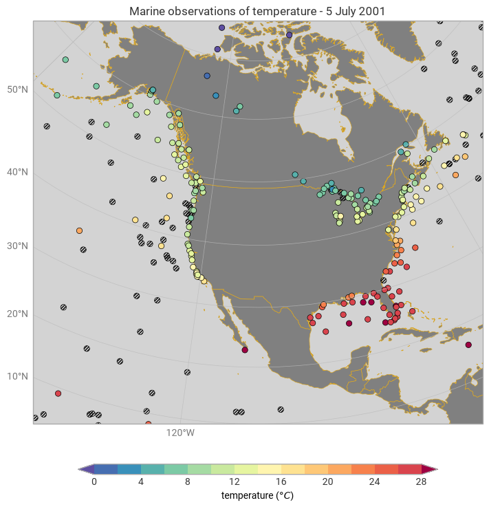
This example demonstrates how to plot point data, like marine observations, as a scatter plot.
[1]:
import earthkit.data as ekd
import earthkit.plots as ekp

data = ekd.from_source(
    "url",
    "https://get.ecmwf.int/repository/test-data/metview/gallery/madis-maritime.nc",
)

style = ekp.styles.Style(
    units="celsius",
    colors="Spectral_r",
    levels=range(0, 30, 2),
    extend="both",
)

my_map = ekp.Map(domain=[-145, -70, 10, 75])

my_map.scatter(data, x="longitude", y="latitude", z="temperature", style=style)

my_map.ocean(zorder=0, color="lightgrey")
my_map.countries(zorder=0, facecolor="grey", edgecolor="goldenrod")
my_map.gridlines()

my_map.legend(location="bottom")

my_map.title("Marine observations of {variable_name} - {cdlDate.parse_time:%-d %B %Y}")

my_map.show()