Loading the data
We load two GRIB files from the earthkit-data sample archive:
fc_storm_st_jude.grib— the high-resolution deterministic forecast (HRES)ens_storm_st_jude.grib— the ensemble forecast (ENS), which contains 51 members: one control forecast (cf, member 0) and 50 perturbed forecasts (pf, members 1–50)
[1]:
import earthkit.data as ekd

import earthkit.plots as ekp

ds_fc = ekd.from_source("sample", "fc_storm_st_jude.grib")  # hi-res forecast
ds_en = ekd.from_source("sample", "ens_storm_st_jude.grib")  # ensemble forecast
Spaghetti plots
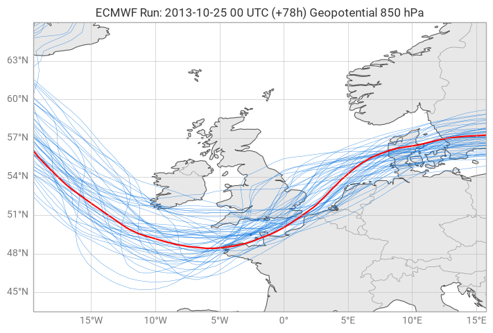
A spaghetti plot overlays a single contour line — drawn at the same value — for every member of an ensemble forecast. The resulting tangle of lines gives an immediate visual impression of forecast uncertainty: where the lines cluster together the ensemble agrees; where they spread apart the forecast is uncertain.
This example uses ECMWF ensemble data from the St Jude storm (October 2013) to produce a spaghetti plot of the 850 hPa geopotential height field.
[2]:
ds_fc.to_fieldlist().ls()
[2]:
| parameter.variable | time.valid_datetime | time.base_datetime | time.step | vertical.level | vertical.level_type | ensemble.member | geography.grid_type | |
|---|---|---|---|---|---|---|---|---|
| 0 | 10fg3 | 2013-10-28 00:00:00 | 2013-10-25 | 3 days 00:00:00 | 0 | surface | 0 | regular_ll |
| 1 | 10fg3 | 2013-10-28 06:00:00 | 2013-10-25 | 3 days 06:00:00 | 0 | surface | 0 | regular_ll |
| 2 | 10fg3 | 2013-10-28 12:00:00 | 2013-10-25 | 3 days 12:00:00 | 0 | surface | 0 | regular_ll |
| 3 | z | 2013-10-28 00:00:00 | 2013-10-25 | 3 days 00:00:00 | 850 | pressure | 0 | regular_ll |
| 4 | z | 2013-10-28 06:00:00 | 2013-10-25 | 3 days 06:00:00 | 850 | pressure | 0 | regular_ll |
| 5 | z | 2013-10-28 12:00:00 | 2013-10-25 | 3 days 12:00:00 | 850 | pressure | 0 | regular_ll |
Inspecting the data
The deterministic forecast contains several fields. We can see it includes 10-metre wind gust (10fg3) and geopotential height (z) at 850 hPa, each at three lead times (00, 06, and 12 UTC on 28 October 2013).
[3]:
z_fc = ds_fc.to_fieldlist().sel({"parameter.variable": "z", "vertical.level": 850, "time.step": 78})
z_en = ds_en.to_fieldlist().sel({"parameter.variable": "z", "vertical.level": 850, "time.step": 78})
Selecting a single valid time
We select the 850 hPa geopotential field (z) at step 78 hours from both datasets. This corresponds to 00 UTC on 28 October 2013 — the time when the St Jude storm made landfall over north-west Europe.
Selecting by time.step=78 ensures both the deterministic (z_fc) and ensemble (z_en) fields are at exactly the same valid time, making the comparison meaningful.
[4]:
ds = z_en.to_xarray()
ds
[4]:
<xarray.Dataset> Size: 608kB
Dimensions:    (member: 51, latitude: 31, longitude: 48)
Coordinates:
  * member     (member) <U2 408B '0' '1' '10' '11' '12' ... '50' '6' '7' '8' '9'
  * latitude   (latitude) float64 248B 66.0 65.25 64.5 63.75 ... 45.0 44.25 43.5
  * longitude  (longitude) float64 384B -19.5 -18.75 -18.0 ... 14.25 15.0 15.75
Data variables:
    z          (member, latitude, longitude) float64 607kB ...
Attributes:
    Conventions:  CF-1.8
institution: ECMWFExamining the ensemble structure
Converting to xarray lets us inspect the shape of the ensemble. The dataset has a member dimension of size 51 (members 0–50), with a spatial grid of 31 × 48 points covering roughly 43–66°N, 20°W–16°E — a region centred on north-west Europe.
[5]:
chart = ekp.Map(figsize=(7, 7))

# the isoline value (geopotential in m²/s²)
cont_level = [12500]

chart.spaghetti(
    z_en,
    levels=cont_level,
    highlight={"metadata.dataType": "cf"},
    label="Ensemble members",
)

chart.land()
chart.coastlines()
chart.borders()
chart.gridlines()

chart.title(
    "ECMWF Run: {base_time:%Y-%m-%d %H} UTC (+{lead_time}h) {variable_name} {level} hPa",
)

chart.legend()

chart.show()
Plotting the spaghetti
chart.spaghetti() iterates over every member in the ensemble and draws a contour line at the chosen level for each one.
Key parameters:
``levels=[12500]`` — the geopotential value (in m²/s²) at which to draw the contour. A single isoline is drawn per member, which is the defining characteristic of a spaghetti plot.
``highlight={“metadata.dataType”: “cf”}`` — picks out the control forecast member (member 0) and renders it in a distinct style so it stands apart from the perturbed members.
``label=”foo”`` — assigns a legend label to the ensemble member lines.
Where the 51 lines overlap closely the ensemble is confident about the position of that height contour. Where they diverge — most visibly around the storm centre — the forecast is uncertain.