Point cloud plots
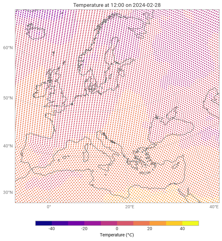
A point cloud plot renders each data value as a coloured scatter point at its geographic location. There is no interpolation — each source point appears as an individual dot whose colour encodes its value.
This makes point_cloud a good choice for:
unstructured grids such as HEALPix or reduced Gaussian, where you want to see the raw cell distribution before any regridding,
sparse observation data where points are irregularly spaced,
quickly checking the coverage and values of a dataset.
For a filled-surface rendering of the same data, use grid_cells (which preserves cell boundaries) or contourf (which interpolates between values).
Example: HEALPix 2 m temperature
We will use a HEALPix GRIB file at H128 resolution. The HEALPix grid distributes points roughly uniformly over the sphere, so a point cloud gives a good visual impression of the native grid density.
[1]:
import earthkit.data as ekd

import earthkit.plots as ekp

data = ekd.from_source("sample", "healpix-h128-nested-2t.grib")

chart = ekp.Map(domain="Europe")

chart.point_cloud(data, units="celsius")

chart.coastlines()
chart.gridlines()
chart.legend()
chart.title()

chart.show()
Controlling point size
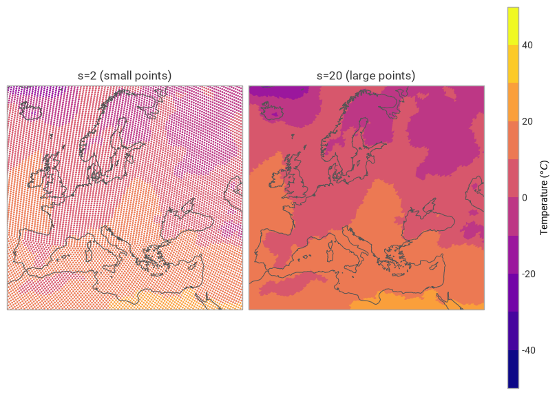
The s keyword argument (passed through to matplotlib’s scatter) controls the point size in points². Smaller values reduce overlap on dense grids; larger values make individual points easier to see when the data is sparse.
[2]:
figure = ekp.Figure(rows=1, columns=2, domain="Europe")

ax = figure.add_map()
ax.point_cloud(data, units="celsius", s=2)
ax.title("s=2 (small points)")

ax = figure.add_map()
ax.point_cloud(data, units="celsius", s=20)
ax.title("s=20 (large points)")

figure.coastlines()
figure.legend(location="right")

figure.show()
Applying a style
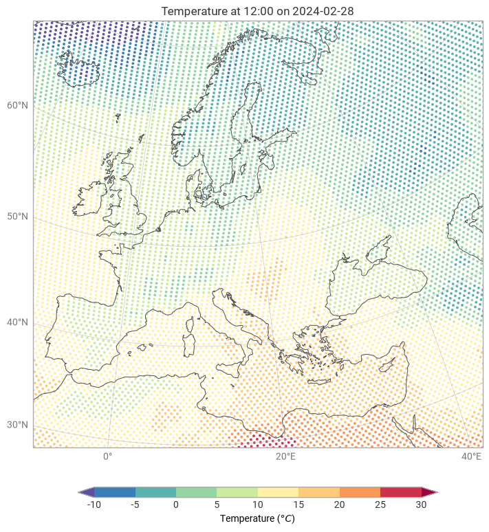
You can pass a Style object to control the colour map, contour levels and units — the same way as with other plotting methods.
[3]:
style = ekp.styles.Style(
    colors="Spectral_r",
    levels=range(-10, 35, 5),
    units="celsius",
    extend="both",
)

chart = ekp.Map(domain="Europe")

chart.point_cloud(data, style=style, s=5)

chart.coastlines()
chart.gridlines()
chart.legend()
chart.title()

chart.show()
Point cloud vs. grid cells
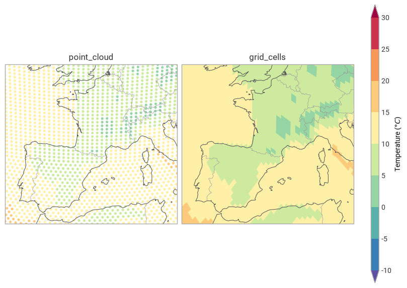
The key difference between point_cloud and grid_cells is how each grid cell is drawn. point_cloud places a single dot at the cell centroid, while grid_cells shades the full area of the cell.
[4]:
figure = ekp.Figure(rows=1, columns=2, domain=["France", "Spain"])

ax = figure.add_map()
ax.point_cloud(data, style=style, s=10)
ax.title("point_cloud")

ax = figure.add_map()
ax.grid_cells(data, style=style)
ax.title("grid_cells")

figure.coastlines()
figure.borders()
figure.legend(location="right")

figure.show()