Visualising data on unstructured grids
In this example, we will explore different methods of visualising unstructured grid data.
[1]:
import numpy as np
import earthkit.plots as ekp
First, let’s generate a sample set of random (unstructured) points.
[2]:
# Example data (unstructured points)
points = np.random.rand(500, 2) * 10  # 500 random points
values = np.sin(points[:, 0]) + np.cos(points[:, 1])  # Some sample data

x = points[:, 0]
y = points[:, 1]
Next, let’s generate a diverging colour palette for visualising this data.
[3]:
style = ekp.styles.Style(
    levels=np.arange(-2, 2.1, 0.25),
    colors="Spectral_r",
)
The most straightforward way to visualise this data is as a scatter plot, which simply shows the unstructured points, coloured according to their value.
[4]:
chart = ekp.Map()

chart.scatter(x=x, y=y, z=values, style=style)

chart.coastlines()
chart.gridlines()

chart.title("Scatter plot")

chart.show()

It’s also possible to plot this data with the contourf method, like any regular gridded data. Under the hood, earthkit will interpolate your unstructured data onto a regular grid in your target coordinate reference system, using the interpolation method of your choice (linear (default), nearest neighbour or cubic).
[5]:
chart = ekp.Map()

chart.contourf(x=x, y=y, z=values, style=style)

chart.scatter(x=points[:, 0], y=points[:, 1], color="none", marker=".")

chart.coastlines()
chart.gridlines()

chart.title("Linear interpolation")

chart.show()
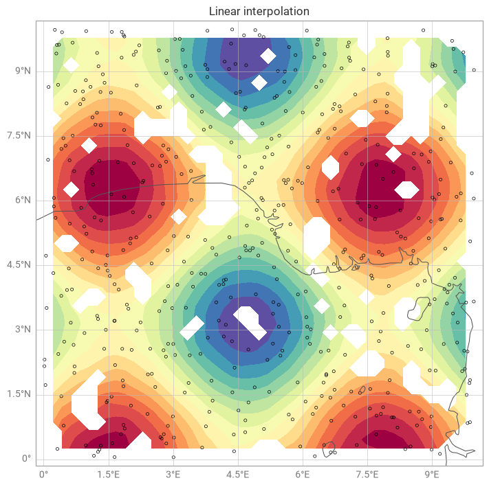
Notice that there are some gaps where the data is sparse. By default, when earthkit-plots recognises your data as completely unstructured, it calculates a distance threshold based on your data resolution within which to interpolate points, leaving sparse areas empty.
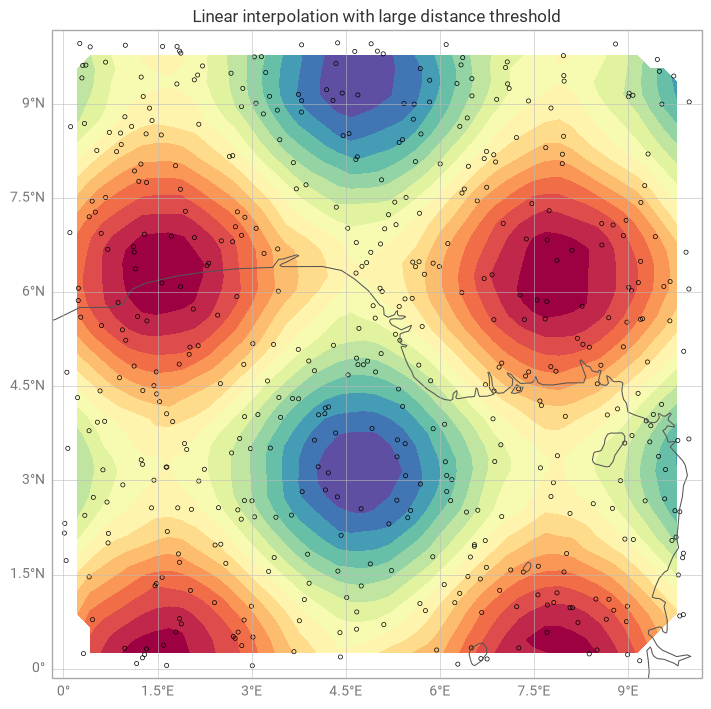
You can have fine-grained control over this by importing the Unstructured class from the resample submodule, and passing you own distance threshold (in the units of the plot’s coordinate system - in this case degrees).
[6]:
from earthkit.plots.resample import Unstructured

chart = ekp.Map()

resample = Unstructured(method="linear", distance_threshold=1)

chart.contourf(x=x, y=y, z=values, style=style, resample=resample)

chart.scatter(x=points[:, 0], y=points[:, 1], color="none", marker=".")

chart.coastlines()
chart.gridlines()

chart.title("Linear interpolation with large distance threshold")

chart.show()
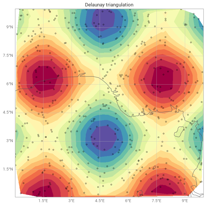
Alternatively, you could use the tricontourf method to draw contour regions given a provided triangulation method (Delauney triangulation by default).
[7]:
chart = ekp.Map()

chart.tricontourf(x=x, y=y, z=values, style=style)

chart.scatter(x=points[:, 0], y=points[:, 1], color="none", marker=".")

chart.coastlines()
chart.gridlines()

chart.title("Delaunay triangulation")

chart.show()