Hatched shading
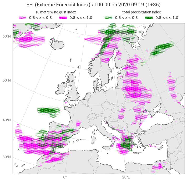
This example demonstrates how to use hatched shading, in this case to show the Extreme Forecast Index (EFI).
[1]:
import earthkit.data as ekd
import earthkit.plots as ekp

data = ekd.from_source("url", "https://get.ecmwf.int/repository/test-data/metview/gallery/efi.grib").to_fieldlist()

fgi = data.sel({"parameter.variable": "10fgi"})
tpi = data.sel({"parameter.variable": "tpi"})

from earthkit.plots.styles import Hatched

LEVELS = [0.6, 0.8, 1.0]
HATCHES = ["." * 5, "o" * 5]

fgi_style = Hatched(
    colors="magenta",
    levels=LEVELS,
    hatches=HATCHES,
    legend_style="disjoint",
)

tpi_style = Hatched(
    colors="green",
    levels=LEVELS,
    hatches=HATCHES,
    legend_style="disjoint",
)

chart = ekp.Map(domain=(-18, 40, 30, 72))

chart.contourf(fgi, style=fgi_style)
chart.contourf(tpi, style=tpi_style)

chart.land()
chart.coastlines()
chart.borders()
chart.gridlines()

chart.figure.title("EFI (Extreme Forecast Index) at {time:%H:%M} on {time:%Y-%m-%d} (T+{lead_time})")

chart.legend(label="{variable_name!l}", location=["top left", "top right"], ncols=2)

chart.show()