Combining filled contours and contour lines
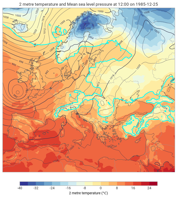
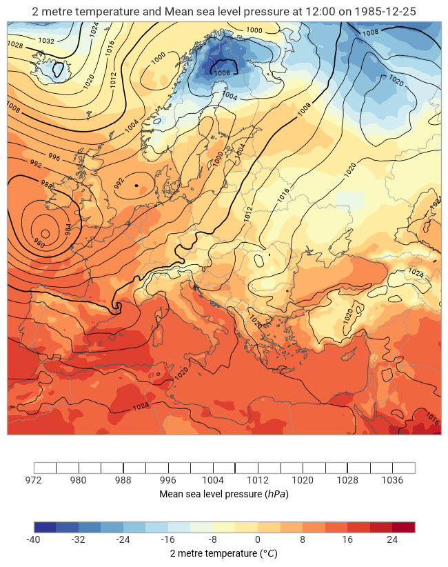
A very common technique in meteorology is to overlay contour lines on top of a filled contour plot — for example, pressure isobars on top of a temperature field. You can also use contour lines to highlight specific levels within the filled field itself.
[1]:
import earthkit.data as ekd

import earthkit.plots as ekp

data = ekd.from_source("sample", "era5-2t-msl-1985122512.grib").to_fieldlist()
pressure = data.sel({"parameter.variable": "msl"})
temperature = data.sel({"parameter.variable": "2t"})
Pressure isobars over filled temperature
The classic synoptic chart combination: filled temperature in the background, pressure isobars on top.
[2]:
t2m_style = ekp.styles.Style(
    units="celsius",
    colors="RdYlBu_r",
    levels={"step": 4, "reference": 0},
)

msl_style = ekp.styles.Contour(
    units="hPa",
    levels={"step": 4, "reference": 1000},
    colors="black",
    linewidths=[0.6, 0.6, 0.6, 0.6, 1.2],
    labels=True,
)

chart = ekp.Map(domain="Europe")
chart.contourf(temperature, style=t2m_style)
chart.contour(pressure, style=msl_style)
chart.legend()
chart.land()
chart.borders()
chart.coastlines()
chart.title()
chart.show()
Highlighting specific levels with contour lines
You can overlay contour lines for the same variable as the filled field to draw attention to particular thresholds. Here we fill temperature and then add a bold blue line at the 0 °C isotherm.
[3]:
chart = ekp.Map(domain="Europe")

# Filled temperature
chart.contourf(
    temperature,
    units="celsius",
    levels={"step": 4, "reference": 0},
    colors="RdYlBu_r",
)

# Pressure isobars
chart.contour(
    pressure,
    units="hPa",
    style="auto",
)

# Freezing isotherm
chart.contour(
    temperature,
    units="celsius",
    levels=[0],
    colors="cyan",
    linewidths=2,
    legend_style=None,
)
chart.legend()
chart.land()
chart.borders()
chart.coastlines()
chart.title()
chart.show()