3. Customising plots
In the previous section, we explored the convenient quickplot function, which allows you to visualise complex datasets with a single line of code. However, while quickplot is a fast and efficient method for quickly previewing data, its minimal API does not easily support highly customised plots with user-defined layouts, styles, and layers.
In this section, we will delve into the fundamental components of earthkit-plots figures and learn how to construct a plot from scratch. Although the API remains high-level, it provides flexibility for more detailed customisation.
The Map class
Plotting geospatial data in earthkit-plots is centred around the Map class. This class provides various methods to efficiently visualise geospatial data with different styles and configurations.
Loading Sample Data
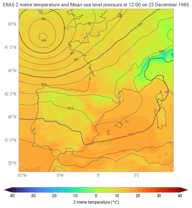
First, let’s load the ERA5 dataset used in the previous example and construct a basic map from scratch.
[1]:
import earthkit as ek

temperature, pressure = ek.data.from_source("sample", "era5-2t-msl-1985122512.grib")
Creating a Map
The Map class provides various methods for plotting and enhancing visualisations. Below is an example of how to create a map and overlay different data layers.
[2]:
chart = ek.plots.Map(domain=["France", "Spain"])

chart.quickplot(temperature, units="celsius")
chart.quickplot(pressure, units="hPa")

chart.legend(label="{variable_name} ({units})")

chart.title("ERA5 {variable_name} at {time:%H:%M on %-d %B %Y}")

chart.coastlines()
chart.gridlines()

chart.show()
The Figure class
[3]:
data = ek.data.from_source("url", "https://get.ecmwf.int/repository/test-data/metview/gallery/fc_msl_wg_joachim.grib")
data.ls()
[3]:
| centre | shortName | typeOfLevel | level | dataDate | dataTime | stepRange | dataType | number | gridType | |
|---|---|---|---|---|---|---|---|---|---|---|
| 0 | ecmf | msl | surface | 0 | 20111215 | 0 | 0 | fc | 0 | regular_ll |
| 1 | ecmf | 10fg6 | surface | 0 | 20111215 | 0 | 0 | fc | 0 | regular_ll |
| 2 | ecmf | msl | surface | 0 | 20111215 | 0 | 6 | fc | 0 | regular_ll |
| 3 | ecmf | 10fg6 | surface | 0 | 20111215 | 0 | 0-6 | fc | 0 | regular_ll |
| 4 | ecmf | msl | surface | 0 | 20111215 | 0 | 12 | fc | 0 | regular_ll |
| 5 | ecmf | 10fg6 | surface | 0 | 20111215 | 0 | 6-12 | fc | 0 | regular_ll |
| 6 | ecmf | msl | surface | 0 | 20111215 | 0 | 18 | fc | 0 | regular_ll |
| 7 | ecmf | 10fg6 | surface | 0 | 20111215 | 0 | 12-18 | fc | 0 | regular_ll |
| 8 | ecmf | msl | surface | 0 | 20111215 | 0 | 24 | fc | 0 | regular_ll |
| 9 | ecmf | 10fg6 | surface | 0 | 20111215 | 0 | 18-24 | fc | 0 | regular_ll |
| 10 | ecmf | msl | surface | 0 | 20111215 | 0 | 30 | fc | 0 | regular_ll |
| 11 | ecmf | 10fg6 | surface | 0 | 20111215 | 0 | 24-30 | fc | 0 | regular_ll |
| 12 | ecmf | msl | surface | 0 | 20111215 | 0 | 36 | fc | 0 | regular_ll |
| 13 | ecmf | 10fg6 | surface | 0 | 20111215 | 0 | 30-36 | fc | 0 | regular_ll |
| 14 | ecmf | msl | surface | 0 | 20111215 | 0 | 42 | fc | 0 | regular_ll |
| 15 | ecmf | 10fg6 | surface | 0 | 20111215 | 0 | 36-42 | fc | 0 | regular_ll |
| 16 | ecmf | msl | surface | 0 | 20111215 | 0 | 48 | fc | 0 | regular_ll |
| 17 | ecmf | 10fg6 | surface | 0 | 20111215 | 0 | 42-48 | fc | 0 | regular_ll |
In the previous section, we visualised this with quickplot, like this:
[4]:
ek.plots.quickplot(data, domain=[-5, 23, 38, 60], groupby="valid_time").show()
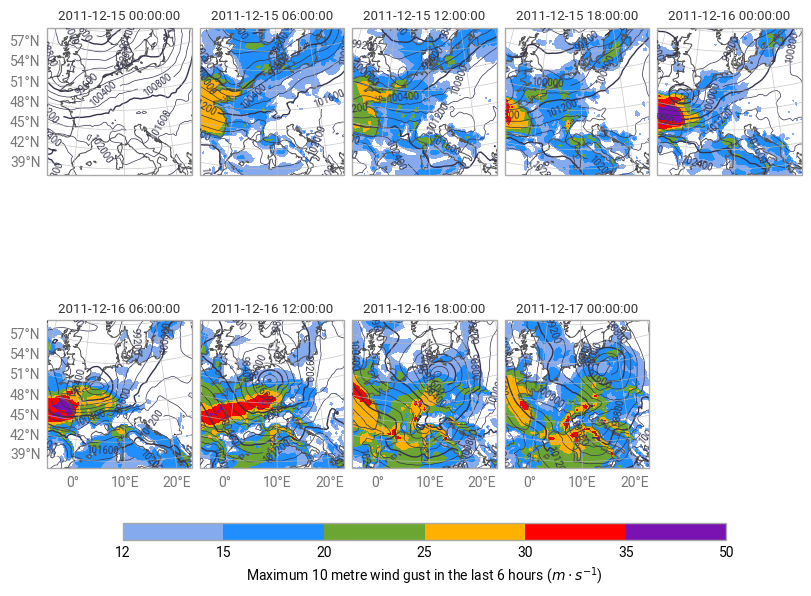
This is a good way to quickly visualise the data, but the layout is not the best, and there is no overall title. For a plot like this, it makes much more sense to construct everything component-by-component.
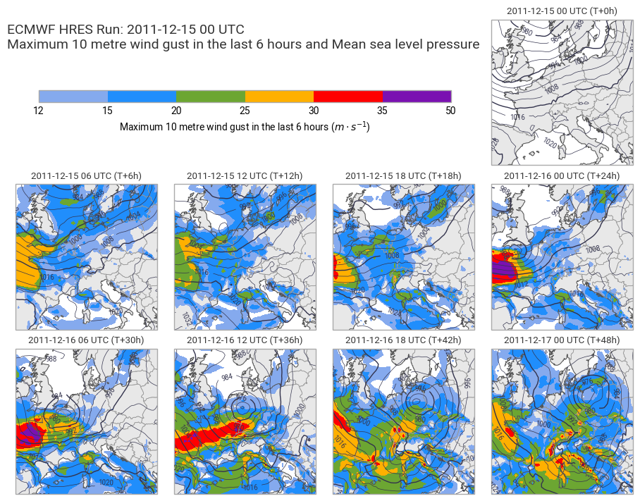
[5]:
import matplotlib.pyplot as plt

figure = ek.plots.Figure(
    domain=[-5, 23, 38, 60],
    size=(9, 7),
    rows=3,
    columns=4,
)

figure.add_map(0, 3)
for i in range(8):
    figure.add_map(1+i//4, i%4)

figure.quickplot(data.sel(shortName="10fg6"))
figure.quickplot(data.sel(shortName="msl"), units="hPa")

figure.land()
figure.coastlines()
figure.borders()

ax = plt.axes((0.05, 0.8, 0.65, 0.025))
figure.legend(ax=ax)

figure.subplot_titles("{time:%Y-%m-%d %H} UTC (T+{lead_time}h)")
figure.title(
    "ECMWF HRES Run: {base_time:%Y-%m-%d %H} UTC\n{variable_name}",
    fontsize=14, horizontalalignment="left", x=0, y=0.96,
)

figure.show()
What’s next?
In the next section we will take a closer look at how to customise and style plots using earthkit-plots.