1. Getting started
Welcome to the earthkit-plots user guide!


earthkit-plots is the visualisation component of earthkit, a suite of Python libraries designed to simplify the access, processing and visualisation of weather and climate science data.
The earthkit ecosystem accelerates Earth science workflows by providing high-level tools that eliminate much of the boilerplate code typically required for common tasks. In this introduction, we’ll demonstrate how to use earthkit-plots to create quick and high-quality geospatial visualisations.
What is earthkit-plots?
earthkit-plots leverages the power of the earthkit ecosystem to make producing publication-quality scientific graphics as simple and convenient as possible.
It is built on top of popular data science and visualisation tools like numpy, xarray, matplotlib and cartopy, but provides a very high-level API enriched with domain-specific knowledge, making it exceptionally easy to use.
Key features include:
⚡ Concise, high-level API
Generate high-quality visualisations with minimal code.
🧠 Intelligent formatting
Titles and labels automatically adapt based on common metadata standards.
🎨 Customisable style libraries
Easily swap styles to match your organisation, project, or personal preferences.
🔍 Automatic data styling
Detects metadata like variables and units to optionally apply appropriate formatting and styling.
🌍 Complex grids supported out-of-the-box
Visualise grids like HEALPix and reduced gaussian without any extra legwork.
Getting started
First things first - let’s import earthkit.
[1]:
import earthkit as ek
Before we plot anything, we’re going to need some data. earthkit-plots comes with earthkit-data built-in, which helps us access many different kinds of data with ease. This tutorial won’t go into detail about how to use earthkit-data, but you can find extensive documentation here.
For this first example, let’s get some handy sample data - in this case, some gridded temperature data from ERA5, ECMWF’s fifth generation reanalysis for the global climate.
[2]:
data = ek.data.from_source("sample", "era5-monthly-mean-2t-199312.grib")
data.ls()
[2]:
| centre | shortName | typeOfLevel | level | dataDate | dataTime | stepRange | dataType | number | gridType | |
|---|---|---|---|---|---|---|---|---|---|---|
| 0 | ecmf | 2t | surface | 0 | 19931201 | 0 | 0 | an | 0 | regular_ll |
The quickest way to get started with earthkit-plots is with the quickplot function, which will take your data and attempt to generate something appropriate based on your data’s metadata.
NOTE: Don’t worry if your data has limited or non-standard metadata - earthkit-plots should still be able to visualise it, just without some of its convenience features like title templating or automatic styles.
[3]:
ek.plots.quickplot(data).show()
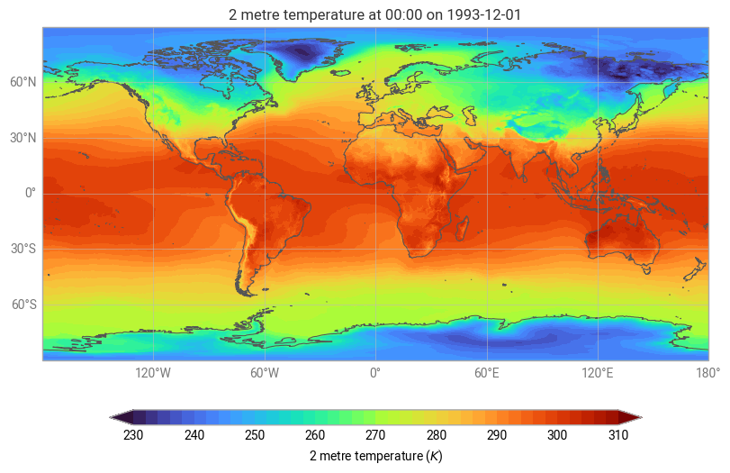
Notice that earthkit-plots was able to generate an automatic title, colour palette, domain and legend from the data, because it was able to understand the rich metadata provided in the source file.
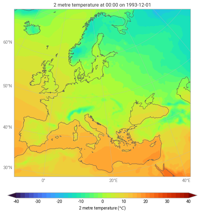
Where possible, earthkit-plots will attempt to show your source data as-is - that is, using the domain, units and projection (where applicable) of your source data. In this case, our source data is global temperature in Kelvin on a regular cylindrical projection. But what if we wanted to quickly visualise this data over Europe, using a suitable map projection and units of Celsius?
earthkit-plots provides many built-in domains for quick and convenient visualisation, including named countries and continents, which will be visualised on a suitable map projection by default.
It also provides a flexible units system powered by pint, allowing you to simply pass the named of the units you’d like to use for visualisation (as long as they’re compatible with your data’s source units!).
[4]:
ek.plots.quickplot(data, domain="Europe", units="celsius").show()
What’s next?
In this section we learnt how to quickly and conveniently plot data in a single line of code with ek.plots.quickplot. In the next section we will explore the more detailed options for quickplots, before moving on to constructing charts component-by-component.