1. Getting started with earthkit-plots
Welcome to the earthkit-plots user guide!
earthkit-plots is the visualisation component of earthkit, a collection of Python libraries designed to simplify the process of accessing, processing and visualising weather and climate science data.
earthkit helps speed up earth science workflows by providing high-level tools which remove large amounts of the boilerplate code usually required for performing common tasks. In this introduction, we are going to use earthkit-plots to quickly and conveniently visualise some data on a graph. We will then use earthkit-data to work with a geospatial dataset, and visualise it on a map.
What is earthkit-plots?
earthkit-plots leverages the power of the earthkit ecosystem to make producing publication-quality scientific graphics as simple and convenient as possible. It is built on top of matplotlib and cartopy, but provides a very high-level API and a wealth of domain-specific knowledge to provide features like:
shortcuts and convenience methods which reduce the amount of code you need to write to produce a high-quality visualisation
formatting of titles and labels using templates which understand a wide range of common metadata standards
creating and swappong out style libraries based on your organisation, project or personal choice
automatic styling of data variables based on metadata detection, including unit detection.
Creating a plot with quickplot
The quickest way to get started with earthkit-plots is with the quickplot submodule.
[1]:
import earthkit.plots.quickplot as qplt
quickplot contains convenience functions for quickly taking some data and putting it onto a plot. It will style the plot based on whichever style library you have installed (more on that later), and is designed to help you quickly and easily take a look at your data with minimum code.
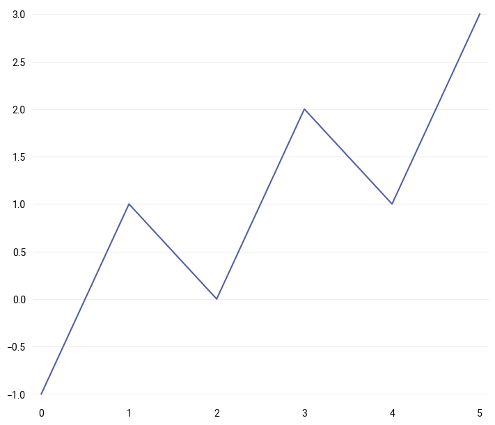
[2]:
p = qplt.plot([-1, 1, 0, 2, 1, 3])
Creating a map with quickmap
The same principles apply for generating quick plots of geospatial data, for which the quickmap submodule should be used.
[3]:
import earthkit.plots.quickmap as qmap
We can load in some sample data using the earthkit-data package:
[4]:
import earthkit.data

data = earthkit.data.from_source("sample", "era5-monthly-mean-2t-199312.grib")
data.ls()
[4]:
| centre | shortName | typeOfLevel | level | dataDate | dataTime | stepRange | dataType | number | gridType | |
|---|---|---|---|---|---|---|---|---|---|---|
| 0 | ecmf | 2t | surface | 0 | 19931201 | 0 | 0 | an | 0 | regular_ll |
Here we have downloaded some sample data - in this case taken from ECMWF’s ERA5 reanalysis dataset, specifically the monthly mean air temperature for December 1993. You can learn more about working with a wide range of data formats in the earthkit-data documentation.
Now that we have some data, all we need to do is pass it to quickmap’s plot function, which will do its best to find a suitable style for the given data:
[5]:
qmap.block(data, domain="France", levels=range(250, 300))
[5]:
<earthkit.plots.components.maps.Map at 0x17fede500>
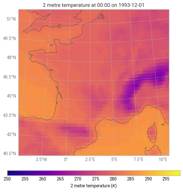
In this case, using the default style library built into earthkit-plots, a pre-defined style which matches the input data has been found and applied. This is optional behaviour, which can be switched off temporarily or permanently using the earthkit-plots schema system, which will be explored in more detail later in this user guide.
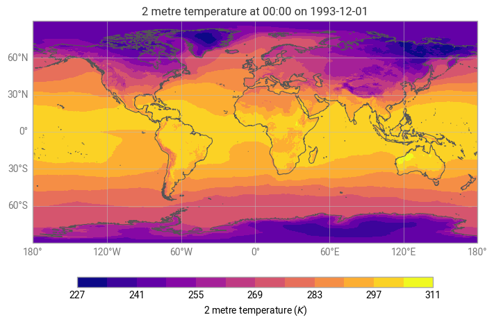
[6]:
with earthkit.plots.schema.set(automatic_styles=False):
    qmap.plot(data)
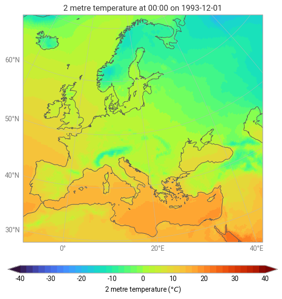
We can also pass information to quickmap about the domain on which we would like to visualise the data, or the units that we would like to use.
[7]:
qmap.plot(data, domain="Europe", units="celsius")
[7]:
<earthkit.plots.components.maps.Map at 0x2870f0f40>